
If you don’t have a responsive website design you are losing business. Period!
Mobile internet use continues soar higher year after year.
You can’t afford to let your business fall behind with an outdated website.
Consider these statistics…
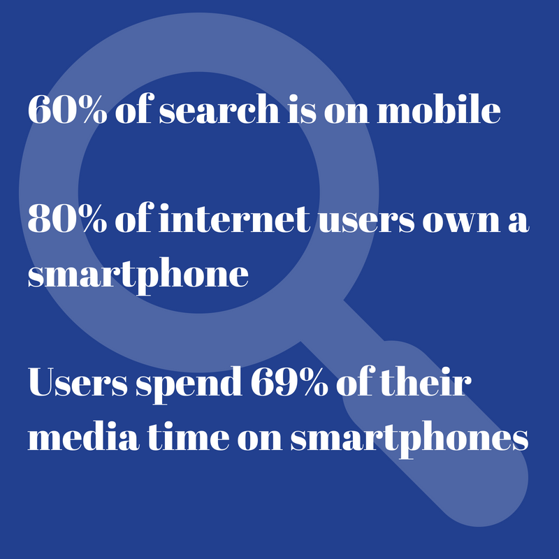
It’s not hard to see why it is so important to have your website that is optimized for mobile devices.
Your website is the face of your business on the internet.
Not having a responsive website design is likely keeping new customers from finding you online.
57% of Internet users say they won’t recommend a business with a poorly designed mobile site.
57%!
57% of Internet users say they won’t recommend a business with a poorly designed mobile site. #wordpress #websitedesign #mobilemarketing Share on X
Just consider how you and the people you know search the internet today.
Do they go to their desktop computer? Do they fire up their laptop?
No!
For my 15-year-old, using a laptop or desktop computer is like me using a mainframe from the 80s.
That trend is aging quickly. It’s not just teenagers using their phones to access the internet.
My 70-year-old parents search the internet primarily on their smartphone.
Having a crappy mobile site turns everyone off and your business can’t afford to do that.
If you’re not sure if your website is optimized for mobile go to Google’s Mobile Friendly Test and put your site to the test.
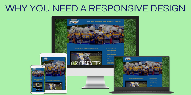
What is Responsive Design and why should you have one?
Responsive website design allows you to build one website that adapts to all kinds of devices.
With the addition of new smartphones and tablets seemingly every day, the number screen sizes of devices has become enormous.
Responsive design utilizes fluid scaling that can be achieved with grid layouts. Simply put, grid layouts are essentially blocks of content that can be organized in multiple columns on larger screens and stacked into a single column on smaller screens.
Breakpoints are another important feature of responsive design.
What do you need a Responsive Design to do on mobile devices?

Make text readable without zooming.
How irritating is it to have to pinch to zoom and them move all over the page with every line you read? Most times, if this is the case, I go look for another site offering the same products or service. From the statistics above, 57% of visitors will do the same.
Provide easy navigation with enough space to tap links.
Make it easy to click links. If your link text or link buttons are too small it will be difficult for visitors to get to the pages they are seeking.
Use a single column layout to avoid horizontal scrolling.
It’s very frustrating to have to scroll side-to-side with every line of text. You have important content for your visitors to read. Make it easy and enjoyable for them to read that content. If not, they’ll go find a competitor.
Make images smaller for quicker loading time.
Mobile users are often loading websites over cellular data. Slow load times is another way to lose visitors. Be sure your images are optimized to avoid hefty load times on mobile devices.
What are the consequences for not having a responsive website design?

It could be hard for your visitors to navigate.
Navigation should be simple and get your visitors to the content quickly and easily. Use easy to click buttons or font links that are big enough to accommodate large fingers like mine.
Your site may load very slowly if at all.
Nothing screams outdated or poorly design site like have things on the page that don’t work. If you site uses video backgrounds be sure to designate images for mobile users. Background videos take a lot bandwidth and data that can keep your site from loading. Your images need to be optimized for mobile. Most responsive designs will allow you to designate different image sizes for mobile.
Your videos and images can be skewed.
If you don’t have a responsive design your videos and images may not display correctly. Video is the biggest culprit regarding this issue. In a non-responsive design the container for the video does not adjust properly and you end up only seeing have of the video player on the screen.
Not having a mobile-friendly website will have a negative effect on google ranking.
The Google algorithm changes often and many times you have to update your website when it does. One addition Goole has made in the past few years is to consider mobile design in their search algorithm. That means if you site is not mobile-ready then it will keep you form ranking higher in Google searches. If you don’t hit the front page for search it is unlikely that your site will be found by new visitors.
If you need help getting your site up-to-date with a new responsive website design, fill out the form below and get a FREE website consultation.
To Your Success,

Steve Stark
Email me at steve@starkwebdesign.com
Follow me on Twitter
Find me on Instagram
Complete the Form Below for a FREE Consultation